Business / Professional
Quiet Authority: The New Visual Grammar of Serious Environments
The old rules of power dressing can now work against you. What changed in the visual language of power — and why.
For several decades the picture of "power dressing" was clear. Built-up shoulders. High heels. Strong colors. Status logos visible. A silhouette cut to project dominance.
That aesthetic, peaking in the 1980s and surviving in mutations into the 2000s, had one central idea: power is seen. It shows itself. It takes up space.
That idea is dead — or at least fading fast in the environments where power actually lives. And if you have not noticed exactly when it changed, you are not alone. The shift was quiet.
Silvia Bellezza's experiment, again
Remember the Bellezza, Gino and Keinan Harvard Business School study on "red sneakers"? That study was not just about sneakers. It was the first serious academic articulation of something already happening at the very top: refusing the obvious status signals, because the refusal itself became the signal.
More broadly, academic literature on status signaling since the 2010s describes a deep inversion of what visible status looks like.
What research says about "quiet status"
In 2020, Giana Eckhardt of Royal Holloway University and Fleura Bardhi published in Marketing Theory a paper titled "New dynamics of social status and distinction." Their conclusion, based on a decade of research: status signaling is increasingly based on inconspicuousness, non-ownership (experiences over possessions), and authenticity based on knowledge and craftsmanship.
In plain terms: new power does not wear the logos. It refuses them.
An earlier study by Han, Nunes and Drèze (2010) in Journal of Marketing proposed a still-useful frame: the four categories of status consumers.
The rich with high status need — they buy loud logos because they want the people around them to see the difference. This is the "new money" category, which is less and less dominant in the public conversation.
The rich with low status need — they buy quiet luxury items only others in their group recognize. This is the "old money" category, which is again becoming the visual model.
The not-rich with high status need — they buy counterfeits or cheap versions of visible logos.
The not-rich with low status need — they simply buy useful items without regard to status.
Interesting is which category sets the rhythm. In the 80s and 90s — category one: visible status, loud logos, Versace, Louis Vuitton with giant monograms. Since the 2010s — category two. Quiet luxury. Loro Piana without logos. Brunello Cucinelli, whose clothes are recognizable only to those who know. The Row.
Why this happened
The literature offers several explanations:
Logos became accessible. When anyone can buy a Gucci belt — or at least a convincing counterfeit — the visible logo loses its marker function. Signals must become finer to keep performing the role of distinction.
Social media shifted the audience. When everyone posts photos of their luxury, loud luxury starts to look cheap. Real money increasingly opts out of that competition — they can afford not to compete.
The values of the top elite changed. Sociology research shows that the new wealthy class (especially the tech wealthy) signals status not through objects but through time (reserved for you), access (events you cannot buy) and knowledge (familiarity with references that are not publicly available).
What this means for you in practice
If you are in a position where you appear in front of people with real power — executives, boards, investors, top-tier clients — the old rules of "power dressing" can now work against you. Here is why.
Loud status markers signal insecurity, not strength. In a modern environment, a person wearing a visible logo, a visibly expensive watch, a visible "power suit" often reads not as successful but as trying to prove success. Because the truly successful have already opted out of that competition.
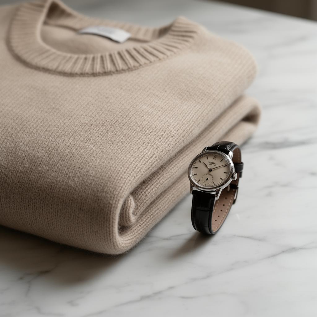
Quality and cut replace the logos. What signals status today is finer: a fabric only an expert recognizes as expensive; a cut that shows it was made for you, not for everyone; details that work only in the eyes of people trained to look.
Calm replaced aggression. Heavy shoulders, strong contrasts, aggressive colors — in a modern environment all of this reads as "trying to project power," which is no longer a sign of power. Quiet confidence, soft silhouette, muted colors, silent authority — that is the new visual grammar.
Contextual knowledge matters more than uniforms. Old model: there is "power dressing" and you wear it. New model: you know exactly what to wear for each specific context, and that fact itself is the status signal. Knowledge beats uniform.
This is not universal — and that matters
I would be dishonest if I left you with the impression that "never wear logos" or "always be quiet." There are environments where the rules differ.
In some industries — fashion, entertainment, visibility-driven politics — loud signals still work. At a real-estate broker pitch in Burgas, bright clothing can win what would lose in a Swiss bank. At a political rally, "quiet power" would communicate to no one.
In environments where status is still being built rather than confirmed, some external markers still play a role. A young consultant entering a new firm cannot use the quiet grammar of a 25-year partner — they have not earned it visually yet.
And culturally — the line between "old money" and "new money" signaling is not the same in London, Vienna, Sofia and Singapore. What reads here as modest can read elsewhere as not serious enough.
What to do with this knowledge
If you are in a high-status environment, look at your wardrobe again. If it is built on 90s principles — hard shoulders, colorful status markers, loud logos, contrastive aggression — it may be time for recalibration. Not because "that is old." But because it now signals something different from what you think it signals.
If you are working your way up, think about how you signal movement to the next level. Try to look at how people two steps above you dress, not one — because one step may look like "almost there," while two gives a cleaner picture of where you are headed. And you will often find that they do not dress "more impressively." They dress more quietly.
And if you are at the point of asking yourself whether you "should look stronger" — flip the question. Maybe you should look more precise. Not more, but more precise. That is the difference between 80s visual strategy and the strategy of today.
Need to discuss a styling solution?
Get in touch